← Back to selected work
03 — WealthTech

StashAway — establishing trust and clarity in robo-investing

StashAway is a leading digital wealth manager providing globally diversified portfolios. Leading StashAway’s website revamp, I anchored the end-to-end delivery—translating user research into structural wireframes, directing two UI designers to build the Design Language System (DLS), and collaborating with offshore developers to deliver a component-based CMS for independent client updates.

StashAway investment app screen showing asset allocation, surrounded by 3D coins and shapes
RoleLead UX Designer
Team2 UI Designers, 1 UX Researcher, Offshore Tech Team
ScopeWebsite Revamp, End-to-End Delivery, CMS Rebuild

The problem

The legacy website failed to reflect StashAway’s updated brand identity and functioned too much like a standard marketing site.

More critically, it lacked the depth, transparency, and data rigour required to convince investment-savvy customers to trust a robo-advisor with their capital.

The approach

Discovery and business alignment

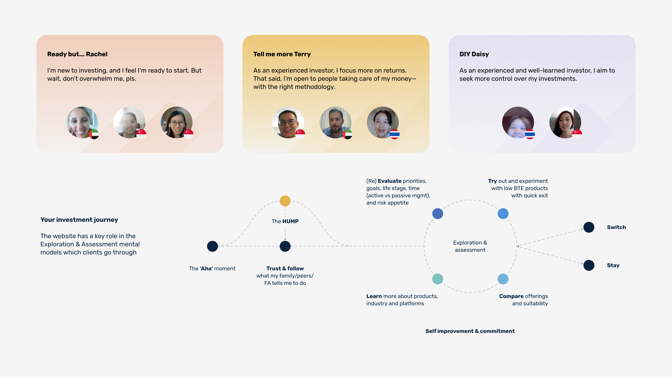
Partnering with a UX researcher, I scribed sessions with eight participants of varying experience. Pairing these external insights with internal stakeholder interviews directly bridged the gap between business goals and customer needs.

Three research personas — Ready but... Rachel, Tell me more Terry and DIY Daisy — above an investment journey map tracing the Aha moment, the Hump, and the exploration and assessment loop through to switch or stay
Personas and the investment journey — the website's role sits in the exploration and assessment loop.

How might we bring trust, clarity, and ease to robo-investing for prospective and investment-savvy customers so that they can evaluate complex portfolio data and start investing with confidence?

Stepping in to anchor the product direction post-research, we translated the findings into four core architectural priorities:

01

Trust & credibility

Surfacing regulatory credentials and institutional legitimacy upfront before asking customers to commit.

02

Verified performance

Giving analytical customers the interactive tools they need to interrogate portfolio data and methodology, rather than just reading marketing headlines.

03

Goal relevance

Replacing generic product descriptions with intent-driven entry points aligned to customers' personal financial motivations.

04

Frictionless onboarding

Eliminating friction in the sign-up flow and introducing interactive calculators earlier in the funnel.

The solution

Bringing trust and clarity

Homepage trust elements

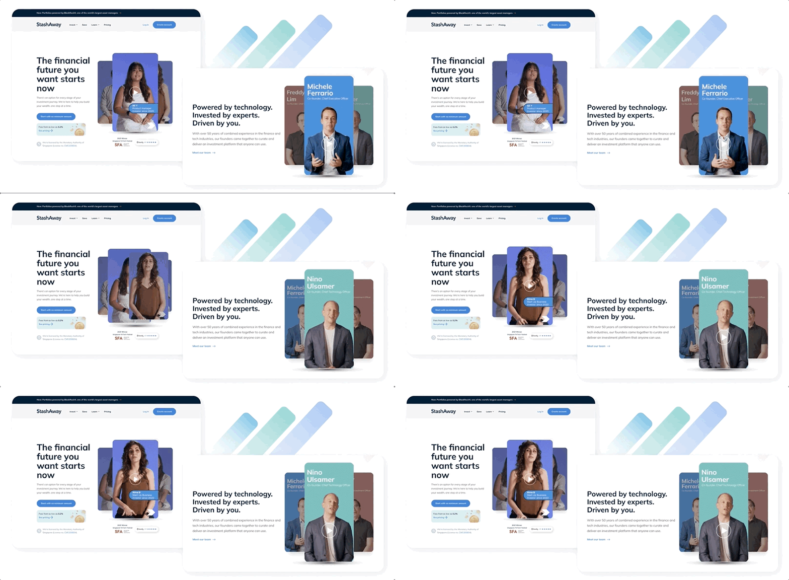
Restructured the landing page to establish institutional credibility above the fold. Key credentials—including MAS licensing and a 4/5 Seedly rating—are displayed prominently alongside digestible value propositions and founder videos that add human accountability.

StashAway homepage above the fold: headline, MAS licence number, 2021 Singapore FinTech Festival award and Seedly rating, alongside a founder video module
Credentials and founder videos, above the fold.

Intent-driven investment discovery

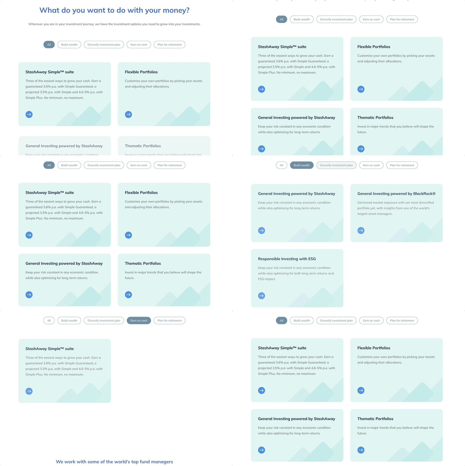
Reorganised product entry points around clear customer intent (such as “Grow Wealth” or “Plan for Retirement”). This allows customers to navigate offerings by financial motivation rather than having to decode industry jargon.

Investment discovery section headed What do you want to do with your money, with intent filters for Build wealth, Diversify investment plan, Earn on cash and Plan for retirement filtering product cards
Product entry points filtered by financial intent, not product category.

Interactive performance & transparency

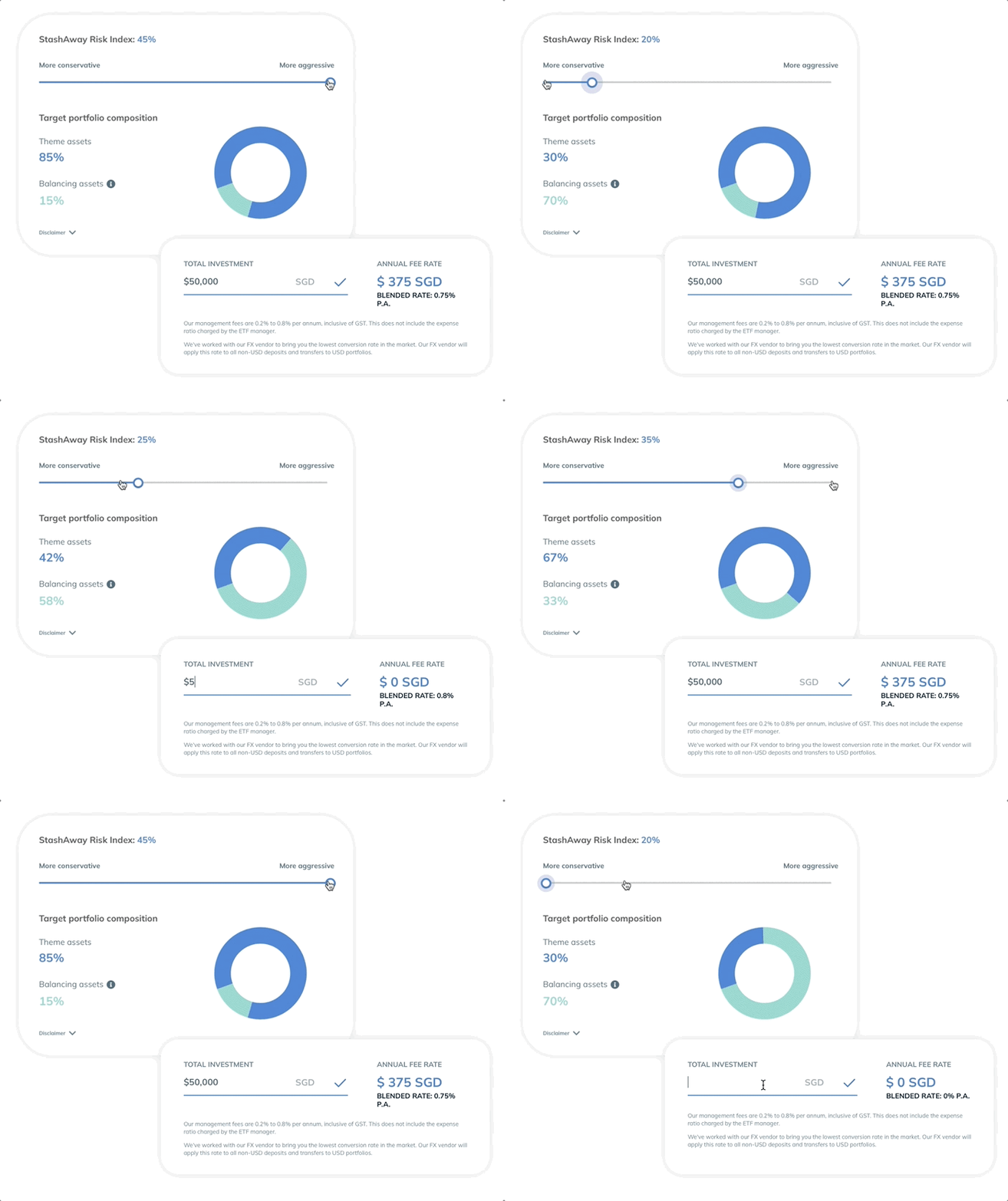
Replaced static charts with dynamic widgets, including an interactive explainer for the StashAway Risk Index (SRI). Customers can test different risk levels to see potential outcomes and inspect the underlying portfolio methodology.

Interactive StashAway Risk Index widget: a conservative-to-aggressive slider updating target portfolio composition, with a linked total investment and annual fee calculator
The SRI explainer — customers test risk levels and see composition and fees update live.

Ease of Onboarding

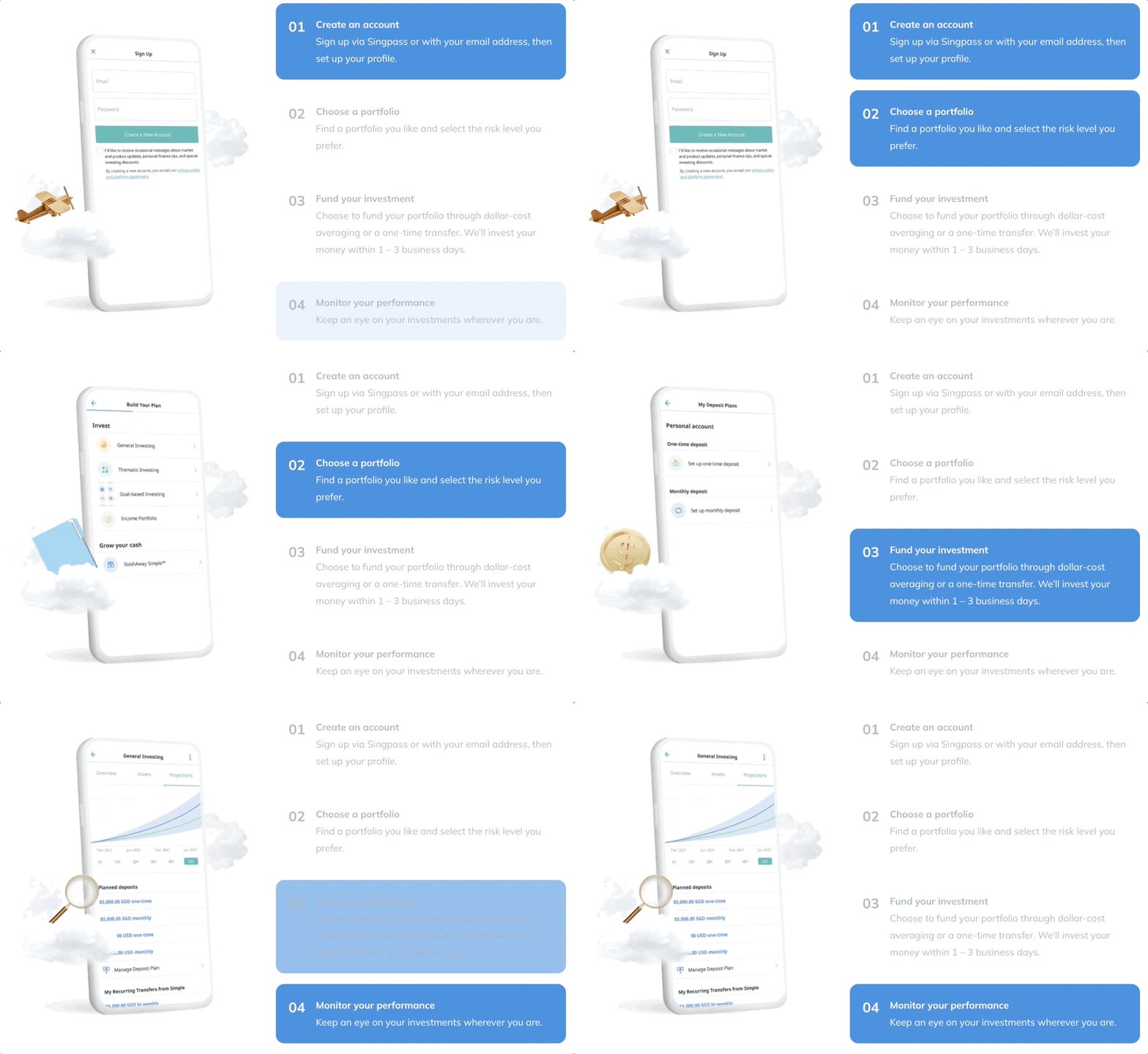
Visualised the sign-up journey with a clear step-by-step guide. By setting upfront expectations, customers knew exactly what was required of them before they committed to the process.

Four-step onboarding explainer — create an account, choose a portfolio, fund your investment, monitor your performance — beside a phone showing the sign-up form
The sign-up journey, set out before customers commit.

Brand-Aligned Design System

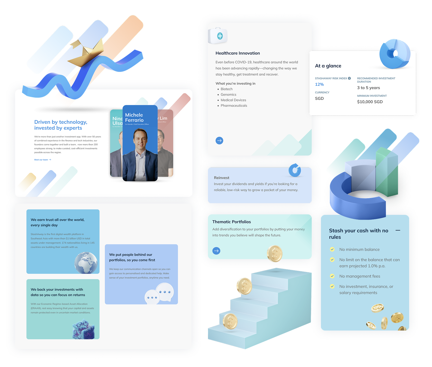
To reflect the brand refresh, we built an entirely new UI library using modular components. I directed the visual execution to include an uplifting colour palette complementing the core dark blue, subtle 3D-style hero visuals to evoke innovation, and brand mnemonics (three rising strokes) woven directly into interface accents.

Design Language System components: founder cards, trust statement tiles, thematic portfolio cards, an at-a-glance data panel and 3D illustration assets
DLS components — cards, data panels and illustration assets built for CMS assembly.

Impact & strategic outcomes

Systemic trust & conversion

Transformed a basic marketing site into a transparent, data-rich experience that bridged the gap between entry-level customers seeking simplicity and analytical customers demanding depth.

100%

Research-led design

Successfully launched and handed over the revamped website templates to the client team, with every navigation choice, layout pattern, and content hierarchy directly tied back to validated research.

Cross-functional delivery

Successfully orchestrated the design track, translating complex financial research into actionable wireframes and guiding UI designers to deliver a flexible system the client could easily manage internally.