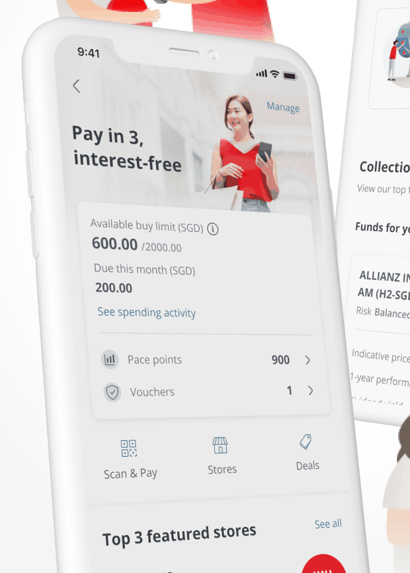
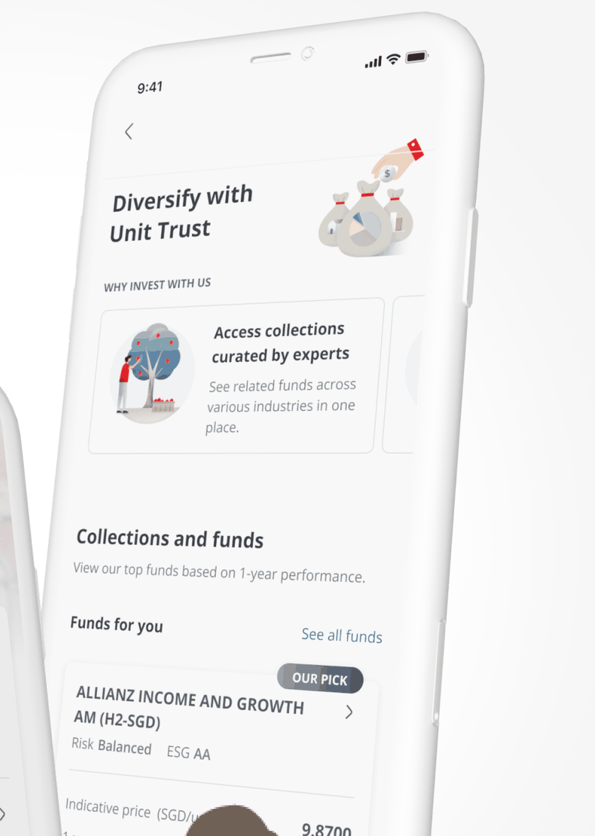
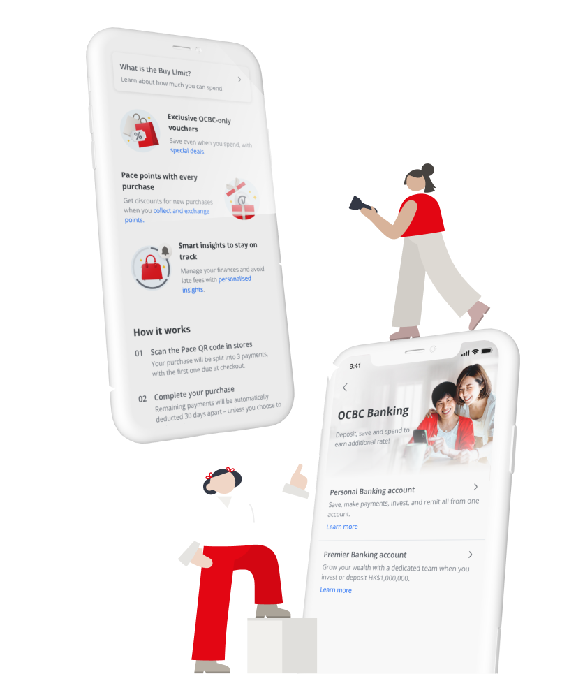
On our long-standing OCBC account, I served as the lead designer for several key digital initiatives. A recurring, major workstream spanning two years was the Hong Kong localisation of investments, offshore accounts, credit cards, and loans across web and mobile platforms using Singapore's Design Language System. To demonstrate my breadth across the account, this case study also highlights two additional projects: leading the end-to-end UX/UI integration for a Buy-Now-Pay-Later (BNPL) feature, and driving the content strategy and user lab testing for Unit Trust products.
The problem
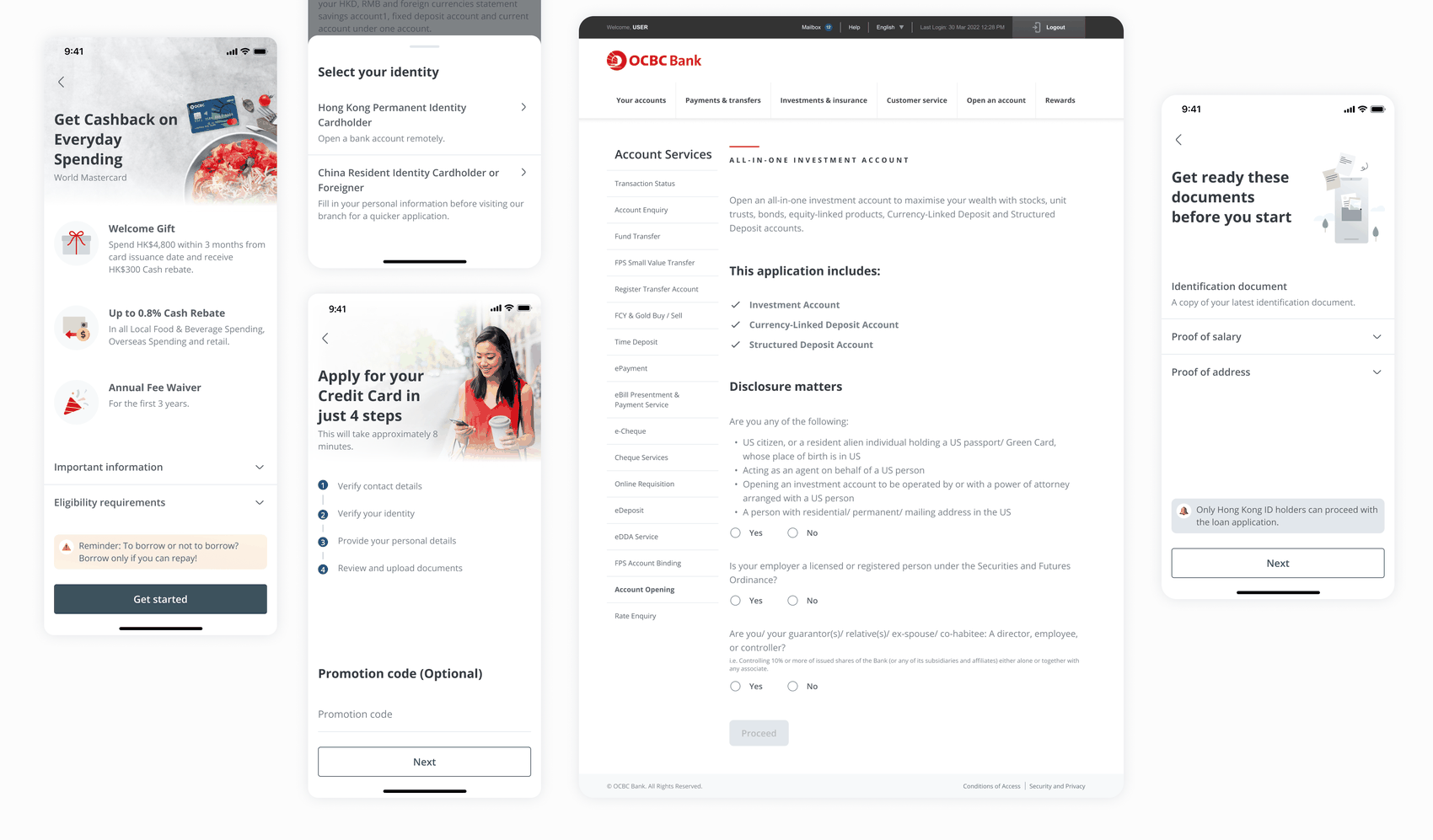
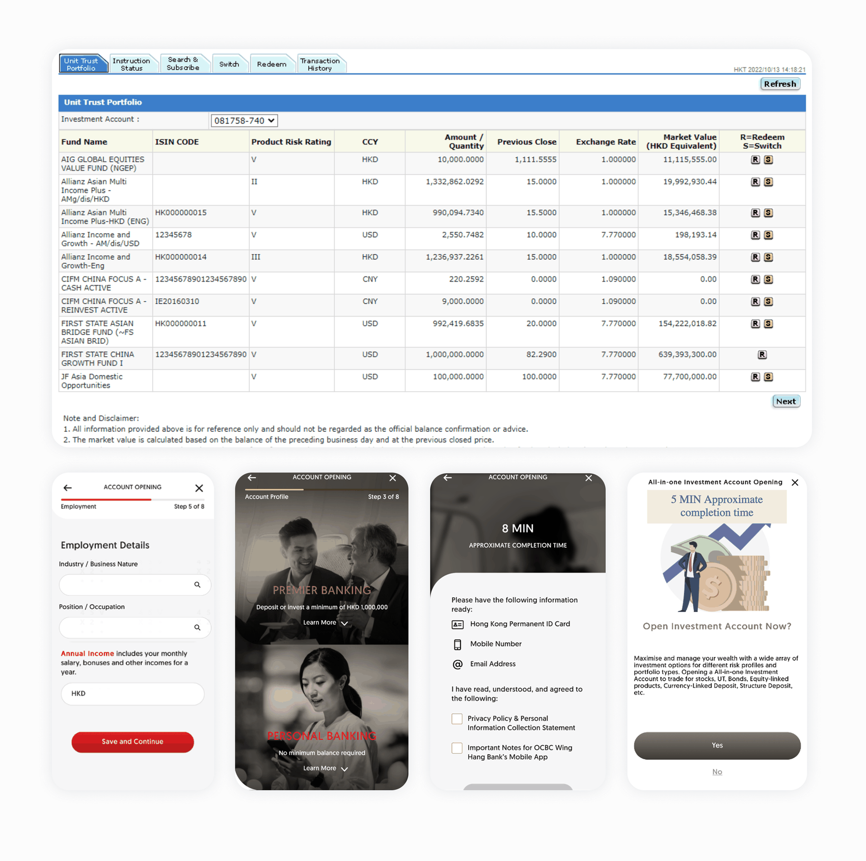
A heuristic review of the existing Hong Kong flows surfaced two problems sitting underneath the surface-level inconsistency: a design logic gap, and a visual one.
The approach
How might we adapt Singapore's scalable design system to unify Hong Kong's fragmented digital banking experience, while natively supporting local regulatory and product complexities?
Walked through Singapore's existing screens and high-level flows to ensure shared agreement before designing Hong Kong-specific screens.
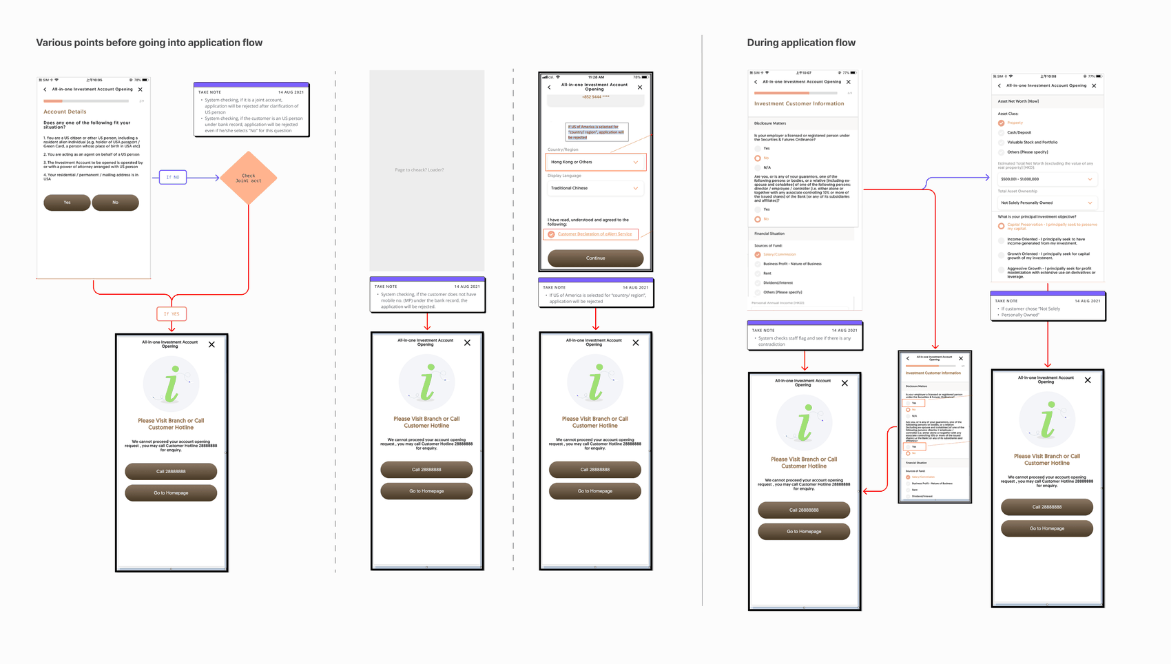
Benchmarked against OCBC Singapore's eligibility-first logic and audited Hong Kong's existing flows to prevent users from reaching dead ends within the application flow.
Mapped Hong Kong's unique product structures against Singapore's models to identify necessary structural changes before adapting the design system.
The solution
To address the identified friction points, I focused on structural refinement and journey optimisation, creating a more intuitive, compliant, and unified application experience.
No upfront eligibility screening meant customers filled in forms only to hit a disqualifying check mid-journey. Restructured flows to place qualification screening, identity selection, and document preparation at the very front of the journey.
Studied and adapted Singapore's Design Language System templates to fit distinct Hong Kong structures.
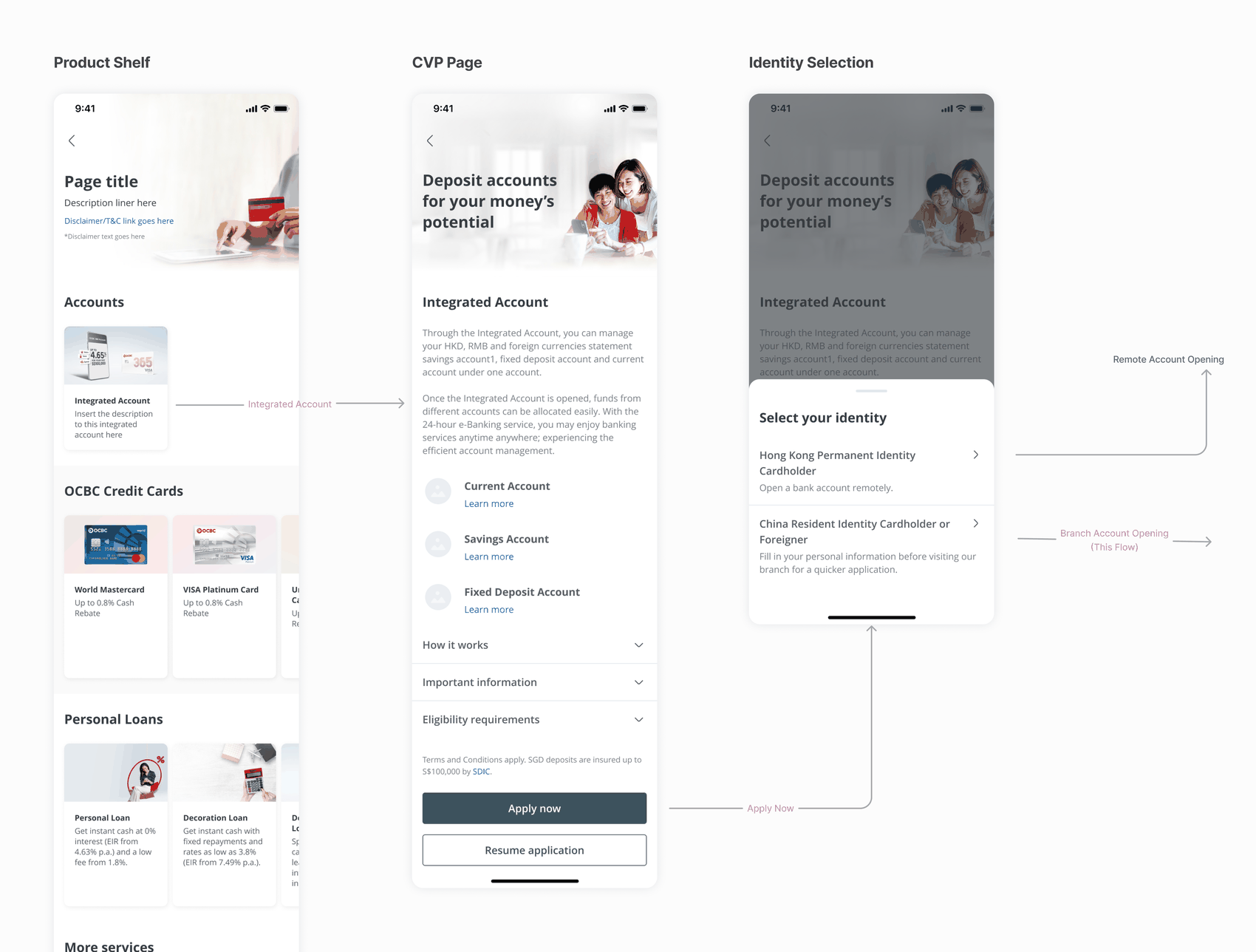
Redesigned the product shelf for Hong Kong's single consolidated account model versus Singapore's multi-account system. Identity Flow: Created branching journeys for Hong Kong IDs (remote) and China Resident IDs (online-to-offline).
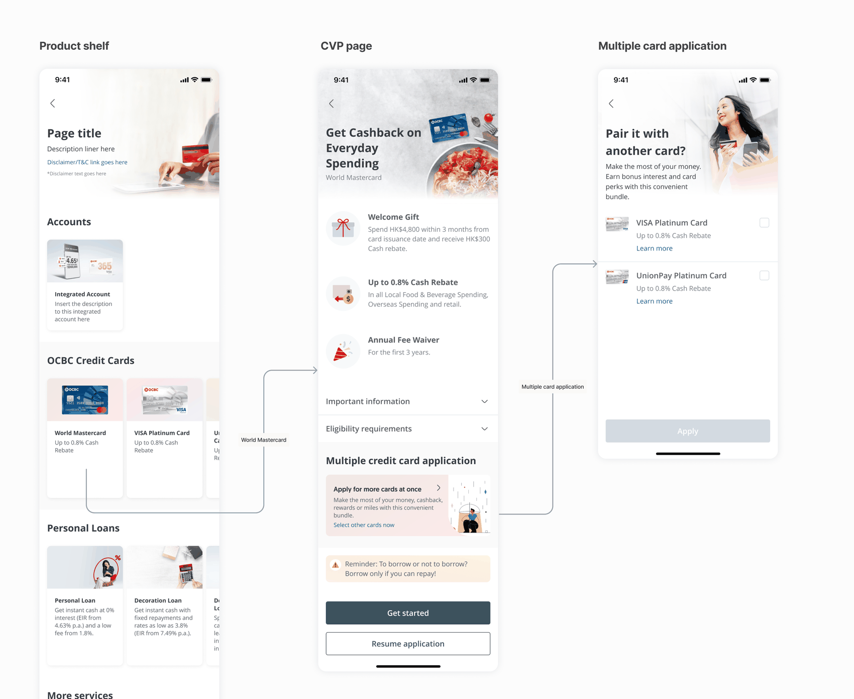
Extended the application flow to give users the option to apply for multiple credit cards together.
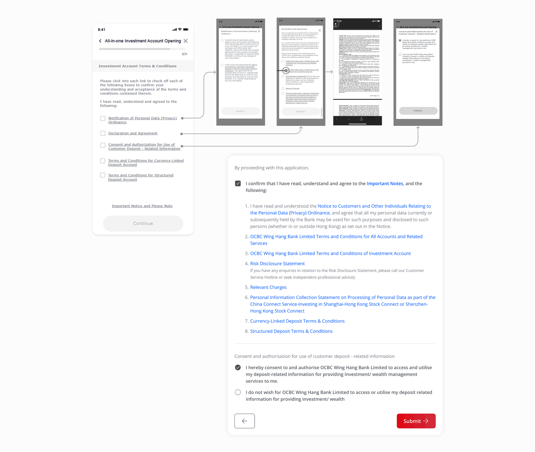
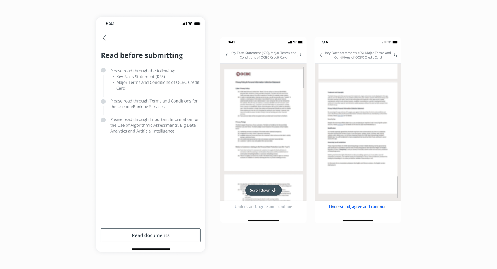
Legal disclaimers and nested T&Cs were scattered across the journey, with much of the Hong Kong market defaulting to raw, ungated PDF documents. Replaced scattered, ungated PDFs with a new scroll-gated consent pattern, forcing users to read to the bottom before continuing — a regulatory requirement Singapore's flow never had to design for, so this became a new component added to the Design Language System, built specifically for Hong Kong's documents.
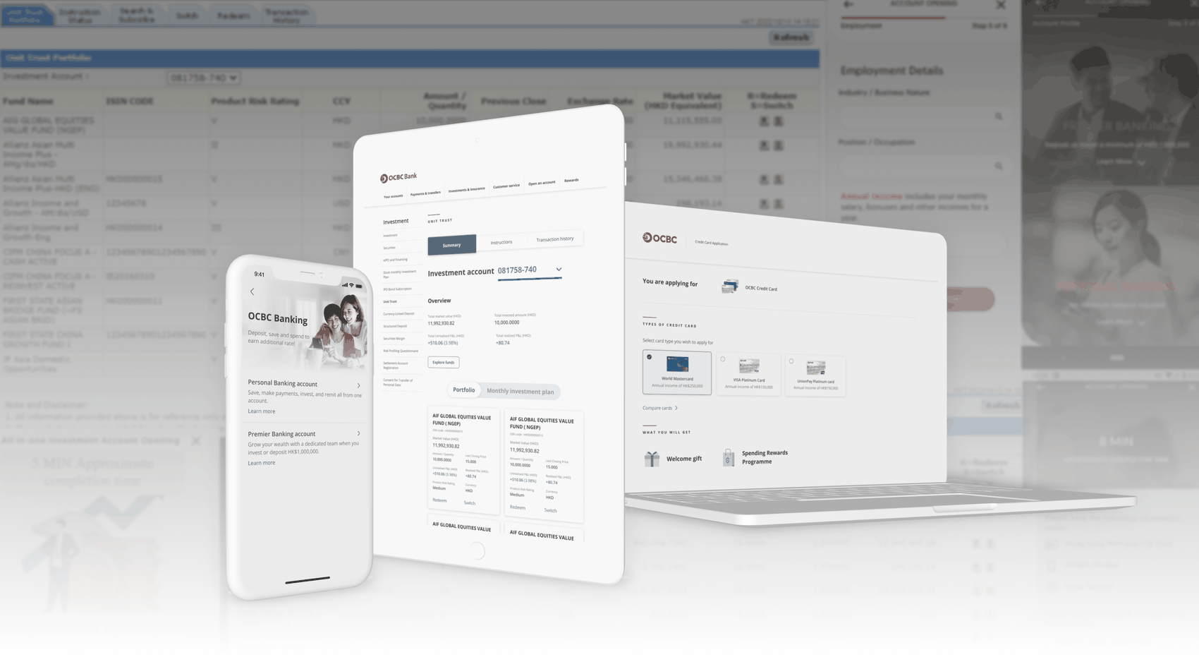
Mobile banking showed different visual treatments between standard and premier account opening, with dotcom and internet banking diverging further still. Aligned all platforms onto a single library, converting dense fund tables into scannable, actionable cards.
Measurable impact
As agency-side design lead, downstream metrics like conversion lift or drop-off reduction sat with OCBC's internal teams post-handoff. What's verifiable from this side of the work is delivery scope and what it replaced:
Delivered four product lines — investment, offshore, credit cards, unsecured loans — to the Hong Kong engineering team.
Standardised T&Cs and acknowledgement processes prior to submission to streamline legal compliance and user flow.
Replaced inconsistent treatments by bringing three platforms — dotcom, internet banking, mobile banking — onto one unified visual system.
Additional workstreams
I led the end-to-end UX/UI integration for a Buy-Now-Pay-Later feature, mapping four distinct customer states based on the client's process map. Through lab usability sessions, we discovered that payment clarity — specifically regarding late fees and deduction schedules — was the primary barrier to user trust, rather than visual polish. In response, I designed a relabelled, multi-access content hierarchy to maintain continuity during the bank-to-third-party handoff. The design reached full stakeholder sign-off with handoff-ready files, though the launch was ultimately halted due to the third-party provider closing.
In a parallel, multi-month workstream, I led the content structure strategy for Unit Trust landing pages. While the client's CX team facilitated the user lab testing, I actively participated and scribed during the sessions to ensure our messaging and sequencing decisions were grounded in actual user data rather than internal assumptions. Alongside this research, I oversaw the design team, guiding the conceptual direction and visual explorations to establish how the new pages should look and read.